Design Tips for Real Estate Business Cards
Table of Contents []
- Designing Real Estate Business Cards
- Practical Design Tips for Effective and Attractive Business Cards for Real Estate Agents by Plastic Card ID
- Choosing the Right Professional Color Schemes
- Incorporating Real Estate Motifs
- The Importance of Including Essential Contact Information
- Incorporating QR Codes for Digital Portfolios
- Enhancing Professional Image with Premium Materials
- Utilizing Effective Typography
- Leveraging White Space for a Clean Design
- Adding a Personal Touch
- Ensuring Print Quality
- Creating a Timeless Design
- Highlighting Special Features and Services
- Making Your Business Cards Multifunctional
- Closing Thoughts and Call to Action
Designing Real Estate Business Cards
Practical Design Tips for Effective and Attractive Business Cards for Real Estate Agents by Plastic Card ID

In the bustling world of real estate, having an effective and attractive business card can make a significant difference in your professional endeavors. At Plastic Card ID, we understand the importance of first impressions. Let's dive into some practical design tips that will help real estate agents create business cards that stand out, contain all the essential information, and enhance their professional image.
Choosing the Right Professional Color Schemes

Designing a business card starts with selecting a professional color scheme that aligns with your brand. The colors you choose can significantly impact how potential clients perceive you. Aim for a palette that exudes professionalism and trustworthiness.
Understanding Color Psychology
Colors can evoke various emotions and reactions from people. For instance, blue often symbolizes trust and stability, while green can signify growth and prosperity. Choosing the right colors can help communicate your brand's personality and values.
Complementary Color Combinations
Effective business cards often use complementary colors to create a harmonious and appealing look. For example, pairing dark and light shades can enhance readability and visual appeal. Remember, simplicity is keyavoid overly bright or clashing colors.
Brand Consistency
Ensure that the colors on your business card match your other marketing materials. Consistency in branding helps reinforce your identity and makes you more recognizable to clients. Use your logo's color palette as a starting point.
Incorporating Real Estate Motifs

Adding real estate motifs to your business card can emphasize your industry and expertise. These elements can be incorporated subtly to maintain a professional look.
Use of Icons and Symbols
Icons like houses, keys, or rooftops can instantly convey the real estate theme. Make sure these icons are clean and simple to avoid cluttering the card. They should complement, not overshadow, your contact information.
Photography and Visuals
High-quality images can also be a great addition. Consider a background image that relates to homes or properties. Ensure the photo is subtle enough not to distract from the information on the card.
Textured Backgrounds
Using textured backgrounds that mimic real estate materials, such as wood or brick textures, can add a unique touch. These backgrounds should be muted to maintain legibility and a clean look.
The Importance of Including Essential Contact Information

Your business card is useless if it doesn't include all the necessary contact details. It should always provide multiple ways for clients to get in touch with you.
Key Details to Include
- Name and Title: Clearly indicate your full name and your role (e.g., Sales Agent).
- Contact Numbers: Include your phone number (make sure to bold it like 650-300-9340).
- Email Address: Provide a professional email address for clients to contact you.
- Office Address: If applicable, add your office location for clients who prefer face-to-face meetings.
Placement and Readability
Ensure your contact information is easily readable. Use a clean, professional font and avoid overly decorative styles. The text size should be large enough to be read without straining the eyes.
Social Media Links
Adding your LinkedIn profile or other relevant social media links can offer clients more ways to connect with and verify your credentials.
Incorporating QR Codes for Digital Portfolios

In today's digital age, QR codes can enhance your business card's functionality by providing instant access to your digital portfolio.
Benefits of QR Codes
QR codes can store a lot of information in a small space. They provide convenience to your clients, who can simply scan the code to view your online portfolio, listings, or social media profiles.
How to Integrate QR Codes
Place the QR code in an area where it does not interfere with your contact details. Ensure it's large enough to be easily scanned but not so large that it overwhelms the design.
Customizing QR Codes
To maintain your card's aesthetic, customize the QR code to match your brand colors. Ensure the code remains functional by testing it with multiple devices before finalizing.
Enhancing Professional Image with Premium Materials

Choosing the right material for your business card can significantly influence how it's perceived. Opting for high-quality materials can reflect your professionalism and attention to detail.
Popular Material Choices
- Glossy Finish: Provides a polished and vibrant look.
- Matte Finish: Offers a sophisticated and modern feel.
- Textured Paper: Adds a tactile element for a unique touch.
Durability and Impression
Investing in durable materials like premium cardstock ensures your card withstands wear and tear. A sturdy card leaves a lasting impression and signifies your commitment to quality.
Utilizing Effective Typography
Typography plays a significant role in the readability and overall aesthetic of your business card. Choosing the right fonts can help convey professionalism and ensure your card is easy to read.
Font Choices
Select a clean, professional font for your information. Avoid overly decorative fonts that can be hard to read. Popular choices include Helvetica, Arial, and Times New Roman.
Consistency in Typography
Maintain consistency in your font choices throughout the card. Use one or two fonts maximum to keep the design cohesive and professional.
Using Font Hierarchy
Utilize font sizes and weights to create a hierarchy, highlighting the most important information. For example, your name can be in a larger font than your contact details.
Leveraging White Space for a Clean Design
White space, or negative space, is the area around the text and images on your card. Using it effectively can enhance readability and create a clean, uncluttered design.
Balancing Elements
Ensure there's enough white space around your text and images to prevent a crowded look. This balance makes your card easier to read and more visually appealing.
Minimalism in Design
A minimalist design often utilizes white space effectively. Limit the amount of text and graphics to only what's necessary. This approach can make your card look elegant and professional.
Focus on Key Information
Prioritize the most critical pieces of information. By focusing on what's essential, you can use white space to enhance those elements, making them stand out.
Adding a Personal Touch
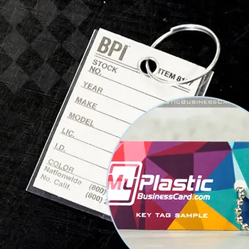
Personalizing your business card can help create a memorable impression. Adding unique elements that reflect your personality or brand can make your card stand out from the rest.
Custom Designs
Consider creating a custom design that reflects your brand. This could include a unique logo, custom illustrations, or personal slogans. Ensure these elements complement your overall design without overshadowing your contact details.
Handwritten Notes
Including a small section for a handwritten note can add a personal touch. This can be useful for jotting down quick messages or reminders when giving out your card.
Unique Shapes and Sizes
While standard business card sizes are more traditional, opting for unique shapes or sizes can make your card more memorable. Consider rounded corners or vertical orientations to stand out.
Ensuring Print Quality

The quality of the print is as important as the design itself. High-resolution printing ensures that your business cards look professional and are easy to read.
Choosing a Reputable Printer
Select a printer known for producing high-quality business cards. Check reviews and request samples to ensure their print quality meets your standards.
High-Resolution Images
Use high-resolution images and graphics to avoid pixelation. This ensures that your card looks clean and professional, reflecting well on your brand.
Color Accuracy
Ensure the colors in your design are accurately reproduced in print. Request a color proof before the final print run to check for any discrepancies.
Creating a Timeless Design
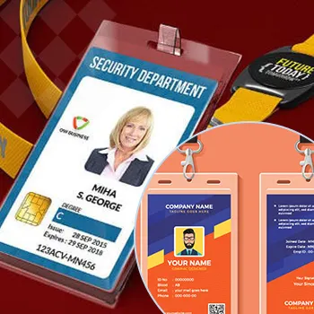
Trends come and go, but a timeless design ensures your business card remains relevant and professional. Aim for a classic and elegant design that won't look outdated quickly.
Avoiding Trendy Elements
While it's tempting to follow design trends, these can make your card look dated as trends change. Opt for classic design elements and neutral color schemes for a timeless look.
Consistency Over Time
Maintain consistency in your design elements over time. This helps build brand recognition and ensures your business card looks professional regardless of changing trends.
Focus on Quality
Investing in high-quality materials and print methods ensures your business card stands the test of time. A well-made card reflects well on your professionalism and dedication to your craft.
Highlighting Special Features and Services
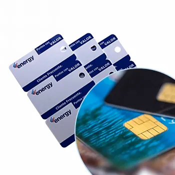
Showcasing special features or services on your business card can help set you apart from competitors. Whether it's awards, specialties, or unique services, let potential clients know what makes you exceptional.
Awards and Certifications
If you've received any awards or certifications, highlight these on your card. This can build credibility and demonstrate your expertise in the real estate industry.
Specialty Areas
If you specialize in a particular type of real estate, such as luxury homes or commercial properties, mention this on your card. This can attract clients looking for specific expertise.
Client Testimonials
Including a brief testimonial or quote from a satisfied client can add credibility and personal touch to your card. Ensure it's concise and relevant to your services.
Making Your Business Cards Multifunctional
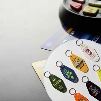
Consider adding functionalities to your business card that provide added value to recipients. This can make your card more useful and memorable.
Appointment Cards
Include space on the back of your card for appointment details. This merges your contact information with a practical use, increasing the likelihood that clients will keep your card.
Loyalty Programs
If you offer a loyalty program, your business card can double as a loyalty card. This adds value for your clients and encourages them to keep your card handy.
Referral Incentives
Encourage clients to refer you by including a referral incentive section. This not only adds functionality to your card but can also help generate new leads.
Get an Instant Quote
Visit PlasticCardID to get started!
Closing Thoughts and Call to Action
Creating an effective and attractive business card is crucial for real estate agents who want to leave a lasting impression. By following these tips, you can design a card that not only provides essential information but also reflects your professionalism and brand. Plastic Card ID is here to help you create the perfect business card that meets all your needs.
Ready to transform your business cards? Contact us at 650-300-9340 today to get started!
Let Plastic Card ID help you make a statement with your business cards. Call us now at 650-300-9340!
Previous Page

