Design Tips for Education Business Cards
Table of Contents []
- Designing Education Business Cards
- This page will offer practical design tips for creating effective and attractive business cards for educators
- Clear and Readable Fonts
- Professional Color Schemes
- Inclusion of Essential Contact Information
- Incorporating QR Codes
- Printing Quality and Materials
- Incorporating Logos and Graphics
- Layout and Spacing
- Unique Touches and Personalization
- Ensuring Professionalism
- Environmental Considerations
- Conclusion and Call to Action
Designing Education Business Cards
This page will offer practical design tips for creating effective and attractive business cards for educators
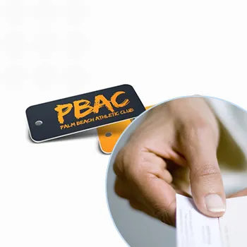
Business cards remain a powerful tool for professional networking. For educators, having an outstanding business card can make a lasting impression on parents, colleagues, and other stakeholders. Plastic Card ID is here to guide you through making the perfect business card.
Our practical tips will focus on several key elements like readable fonts, professional color schemes, and essential contact information. We'll also discuss how incorporating modern elements like QR codes can enhance your card's effectiveness.
Clear and Readable Fonts
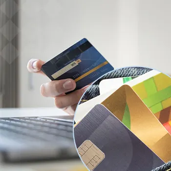
When it comes to designing a business card, the font is one of the most critical components. It must be readable and professional to ensure that your information is conveyed effortlessly. Plastic Card ID recommends avoiding overly decorative fonts that can be difficult to read.
Choosing the Right Font Style
Serif fonts are traditional and convey professionalism. However, sans-serif fonts are often easier to read, especially in smaller print. Fonts such as Arial, Helvetica, and Times New Roman are excellent choices.
It's also crucial to consider font size. A size of 10-12 points for the main text is generally a good range. Larger fonts can be used for headings or your name to make these elements stand out.
Consistency in Fonts
Choose one or two fonts and stick to them throughout your business card. Consistency in font style will give your card a cohesive and polished appearance. Mixing too many fonts can make your card look cluttered.
- Use bold fonts for emphasis
- Avoid using all caps
- Ensure enough spacing between lines
Font Color
While it may be tempting to use a variety of colors, sticking to one or two colors will create a cleaner look. Dark text on a light background is usually the most readable.
Our team at Plastic Card ID can help you choose the perfect font combinations for your business card. Call 650-300-9340 for assistance today.
Professional Color Schemes

Color choices can significantly impact the first impression your business card makes. Professional color schemes typically include muted tones like navy, black, and gray. However, adding a touch of bright color as an accent can make your card stand out.
The Psychology of Colors
Certain colors evoke specific emotions. For example, blue symbolizes trust and reliability, while green represents growth and harmony. Understanding these associations can help you choose colors that reflect your professional qualities.
Two to Three Colors Maximum
Avoid overloading your card with multiple colors. A two-to-three color palette ensures your card is visually appealing without being overwhelming. It is also easier to achieve a balanced design with fewer colors.
- Choose a primary color for the background
- Select a secondary color for accents
- Consider a neutral color for text
Contrasting Colors
Ensure there is enough contrast between your text and background to make your information easily readable. Light text on a dark background or vice versa typically offers the best visibility.
Plastic Card ID offers comprehensive design services to help you select the most effective color schemes for your business card. Reach out at 650-300-9340
Inclusion of Essential Contact Information

Your business card should provide all the necessary contact information without looking cluttered. At Plastic Card ID, we ensure that every element is included thoughtfully and proportionately.
Primary Contact Details
The essentials include your name, job title, school name, phone number, and email address. These should be the first bits of information anyone should see. Make sure this information stands out and is easily readable.
Position your contact details logically. Typically, your name and title are at the top with your contact details at the bottom.
Additional Contact Information
If you have other relevant contact points like a personal website, social media handles, or LinkedIn profile, feel free to include these. But remember, less is more.
- Include a website URL
- Social media handles relevant to your profession
- LinkedIn profile link
Ensuring Information Accuracy
Before printing your business cards, double-check all the contact information for accuracy. A minor typo can lead to confusion or, worse, lost networking opportunities. Always proofread your business card thoroughly.
Plastic Card ID ensures that all contact information on your business card is accurate and well-organized. Call 650-300-9340 for a thorough review.
Incorporating QR Codes
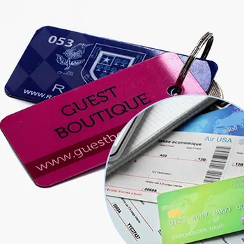
QR codes are a modern addition to traditional business cards that offer a quick and efficient way to access your digital information. Plastic Card ID can integrate QR codes seamlessly into your card design.
Benefits of QR Codes
QR codes can store various types of information, such as a link to your personal website, an online portfolio, or even a digital version of your CV. Attendees at conferences or students' parents can scan these codes to get more details instantly.
Using QR codes makes it easier for someone to retain your information, as it eliminates the need to manually input data into their devices.
Designing QR Codes for Business Cards
When designing QR codes, ensure they are sized appropriately. Too small, and they might not scan correctly; too large, and they might take up too much space on your card.
Place the QR code in a location that is easily noticeable but doesn't overwhelm other essential information. Often, the back of the card is an excellent spot for a QR code.
Custom QR Codes
You can customize QR codes with colors and logos to fit your business card's design scheme. However, make sure the code remains functional. Avoid altering the core elements of the QR code too much to ensure scanning compatibility.
For best QR code integration, consult with us at 650-300-9340. Plastic Card ID
Printing Quality and Materials
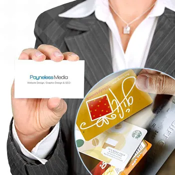
The quality of your business card speaks volumes about you as a professional. Plastic Card ID emphasizes the importance of high-quality printing and materials. We provide a variety of options to suit your needs.
Paper Quality
Thicker cardstock is often perceived as more professional and durable. Options like matte, glossy, and textured finishes can add a unique touch to your business card.
Choosing a high-quality paper ensures that your business card looks and feels premium, making a better impression on those who receive it.
Plastic Business Cards
If you want your business card to stand out, consider plastic cards. These are more durable and have a unique look and feel. They are also waterproof, which can be a huge advantage.
- Durable and long-lasting
- Waterproof
- Unique appearance
Printing Quality
High-resolution printing ensures that all elements on your card, from text to graphics, are crisp and clear. Poor printing can make your card look unprofessional and may result in important details being hard to read.
We at Plastic Card ID offer top-notch printing services to ensure your business card looks flawless. Contact us at 650-300-9340 to learn about our printing options.
Incorporating Logos and Graphics

Logos and graphics can enhance the visual appeal of your business card. They add a layer of branding and make the card more memorable.
Choosing the Right Logos
Include a logo that represents your school or organization to add credibility. The logo should be of high resolution to ensure it looks sharp when printed.
Position the logo strategically. It should be prominent but not overshadow your contact details. Usually, the top left or right corners are ideal spots for logos.
Additional Graphics
Other graphics, like icons for phone numbers or social media, can add a touch of flair. These should be simple and consistent with the overall design.
- High-resolution logos
- Minimalistic icons
- Professional graphics
Consistency in Design
Ensure that all graphics and logos complement each other and the overall design of the business card. Using too many different styles can make the card look chaotic.
The team at Plastic Card ID is skilled at integrating logos and graphics into business cards for a polished and professional look. Call 650-300-9340 to get personalized design assistance.
Layout and Spacing
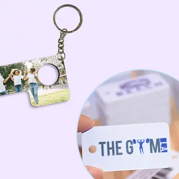
The layout and spacing of your business card are crucial to its readability and overall appearance. Plastic Card ID advises keeping the design clean and uncluttered.
Effective Use of Space
Balance the use of space on your card to ensure that no area looks too crowded or too empty. Even spacing ensures that every piece of information is easily accessible.
It's often a good idea to divide your card into sections: one for your name and title, another for contact information, and a third for logos or QR codes.
Simple and Clean Design
Avoid overloading your card with too much text or too many graphics. A simple design is usually more effective. Stick to essential information and minimalistic graphics.
- Balanced sections
- Avoid clutter
- Simple graphics
Aligning Elements
Ensure that all text and graphics are aligned correctly. Misaligned elements can make your card look unprofessional. Use grid lines and templates to keep everything in order.
We at Plastic Card ID offer layout design services to help you create a balanced and visually appealing business card. Contact us at 650-300-9340 for expert guidance.
Unique Touches and Personalization
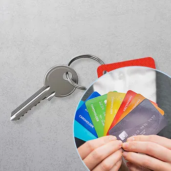
Adding unique touches to your business card can make it stand out among others. Plastic Card ID specializes in creating personalized and unique business cards that reflect your personality and profession.
Laminating and Special Finishes
Laminating your business card can give it a polished look and make it more durable. Special finishes like foil stamping add a touch of luxury and can make key elements stand out.
Choose finishes that align with your personal brand and the message you want to convey. Glossy finishes are eye-catching, while matte finishes are more understated.
Custom Shapes and Sizes
Standard business cards are rectangular, but custom shapes and sizes can set your card apart. Rounded corners or a unique shape can leave a lasting impression.
- Laminating
- Foil stamping
- Custom shapes
Personal Messages
Including a personal message or an educational quote can add a unique touch to your card. This can make your card more memorable and engaging.
Our team at 650-300-9340 Plastic Card ID is here to help you add unique touches to your business card. Call us today!
Ensuring Professionalism
Professionalism is key when designing a business card for educators. Plastic Card ID ensures that every aspect of your card reflects your professional image.
Consistent Branding
Keep your branding consistent across your business card and other professional materials. Use the same colors, fonts, and logos to create a cohesive look.
This consistency strengthens your professional image and makes it easier for people to recognize your brand.
Quality Over Quantity
Avoid overcrowding your business card with too much information. Quality and clarity should always take precedence over quantity. Focus on including just the essentials.
- Consistent branding
- Quality over quantity
- Essential information only
Timely Updates
Ensure your information is always up to date. Outdated contact information or job titles can confuse recipients and damage your professional image.
We at Plastic Card ID can help you maintain the professionalism of your business card. Reach us at 650-300-9340 for updates.
Environmental Considerations

No modern design guide would be complete without mentioning environmental considerations. Plastic Card ID is dedicated to providing environmentally friendly business card options.
Recycled Paper
Using recycled paper for your business cards is a great way to reduce your environmental impact. Recycled paper options are available in various textures and weights.
Recycled paper can be just as high-quality as new paper, and many people appreciate the eco-friendly choice.
Digital Business Cards
Consider digital business cards as an eco-friendly alternative. A QR code on a standard card can link to a digital version, reducing the number of physical cards you need to print.
- Recycled paper options
- Eco-friendly printing inks
- Digital business cards
Sustainable Practices
At Plastic Card ID, we use sustainable practices in our printing processes. By choosing us, you can ensure that your business cards are produced in an environmentally friendly manner.
Contact us 650-300-9340 Plastic Card ID for eco-friendly business card solutions.
Get an Instant Quote
Visit PlasticCardID to get started!
Conclusion and Call to Action
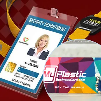
Plastic Card ID is committed to helping educators create the perfect business card. Our expertise in fonts, colors, contact information, QR codes, and printing ensures your card reflects your professionalism and meets all your needs.
Ready to get started on your custom business card? 650-300-9340
Next Page

