Design Tips for Marketing Business Cards
Table of Contents []
- Designing Marketing Business Cards
- Practical Design Tips for Creating Effective and Attractive Business Cards
- Choosing the Right Professional Color Schemes
- Incorporating Marketing Motifs
- Including Essential Contact Information
- Adding QR Codes for Easy Digital Access
- Using High-Quality Materials
- Design Layout and Typography
- Personalization and Branding
- Leveraging Unique Printing Techniques
- Considering Cultural Elements
- Eco-friendly and Sustainable Options
- Periodic Updates
- Final Thoughts and Conclusion
Designing Marketing Business Cards
Practical Design Tips for Creating Effective and Attractive Business Cards
Welcome to Plastic Card ID's ultimate guide for creating eye-catching and professional business cards tailored for marketing professionals. Our job is to ensure your business cards shine and leave a lasting impression, and we're here to share some practical design tips that cover all key aspects of professional business card design. You can easily reach us for any questions or new orders at 650-300-9340. Let's dive in!
Choosing the Right Professional Color Schemes
The choice of colors on your business card can set the tone for your entire brand. Marketing professionals should be mindful of selecting a color scheme that not only grabs attention but also conveys professionalism.
Understanding Color Psychology
Colors evoke emotions and reactions. For instance, blue typically represents trust and reliability, while red indicates passion and energy. Knowing the psychological effects of colors can help you choose a palette that aligns with your brand's message.
We recommend using two to three primary colors to maintain a clean and cohesive design. Experiment with different combinations and choose one that represents your brand's identity effectively.
Creating Complementary Color Schemes
Complementary colors are pairs that naturally look good together, such as blue and orange or purple and yellow. Using a color wheel can help identify these pairs, ensuring your card remains visually appealing.
Don't shy away from using online tools that can generate complementary palettes for you. With a nuanced approach, you can make your card stand out and stay memorable.
Brand Consistency
Your business card should reflect the same color scheme as your other marketing materials, like your website and social media profiles. Consistency builds brand recognition and trust.
This helps in creating a unified brand image that people can easily identify. Unified colors across all platforms reinforce your professional look.
Incorporating Marketing Motifs
Design motifs are visual elements that can reinforce key aspects of your brand. Incorporating subtle yet striking motifs can significantly enhance your business card.
Iconography
Using icons that represent your industry or service can give clients an instant understanding of your expertise. For example, a megaphone icon might signify marketing, while a smartphone icon could denote digital services.
Keep these icons simple and not too overwhelming. The goal is to support the text, not overshadow it.
Patterns and Textures
Patterns and textures can add depth to your business card. Subtle backgrounds like a light weave or a dot grid can make your card more tactile and memorable.
While experimenting with textures, ensure they don't overwhelm the core information on the card. Balance is essential for a polished look.
Minimalistic Elements
Sometimes, less is more. A minimalist design can be just as striking if done well. Focus on negative space and clean lines to keep the card neat and professional.
The emphasis should be on readability and aesthetic appeal. Any motif or design cue should compliment the key information, not complicate it.
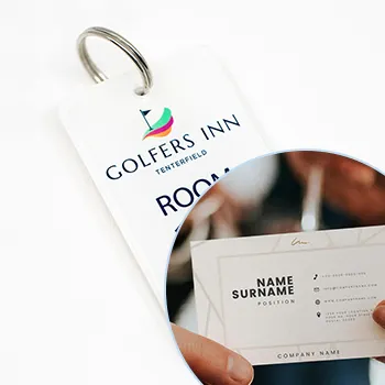
Including Essential Contact Information
The purpose of a business card is to make it easy for others to contact you. Ensure that all critical information is included clearly and concisely.
Contact Details
List your name, job title, company name, and all relevant contact information such as email, phone number, and website. Make sure this information is easy to locate and read.
Prioritize the order of information based on how you'd like to be contacted. The phone number and email should always be prominent.
Social Media Handles
If social media plays a significant role in your business, including your social media handles can be beneficial. Make sure these handles are up-to-date and professional.
Listing handles for platforms like LinkedIn, Twitter, or Instagram can show versatility and modernity.
Avoiding Clutter
While including all essential details, avoid cluttering your business card with too much information. A simple and clean design makes it easier for recipients to find your contact details.
Focus on what's most important and cut out any unnecessary fluff. A clear business card invites more engagement than a crowded one.
Adding QR Codes for Easy Digital Access

In the digital age, QR codes can bridge the gap between your physical business card and your online presence, like portfolios and social media profiles.
Generating QR Codes
QR codes can be generated easily using online tools. Ensure the link embedded within the QR code directs to a professional and relevant site, such as your LinkedIn profile or digital portfolio.
A custom QR code design with embedded logos can add a splash of creativity without compromising functionality.
Placement of QR Codes
Place your QR code in a spot where it doesn't interfere with the main elements of your business card. The back of the card or a corner usually works well.
Test the QR code's functionality before finalizing the design to ensure it scans correctly and links to the right webpage.
Benefits of QR Codes
QR codes provide instant access to a wider range of information that a small business card can't hold. They add a modern twist to your traditional contact methods.
By making it easier for clients to access more about you with a single scan, you enhance your card's practicality and modern appeal.
Get an Instant Quote
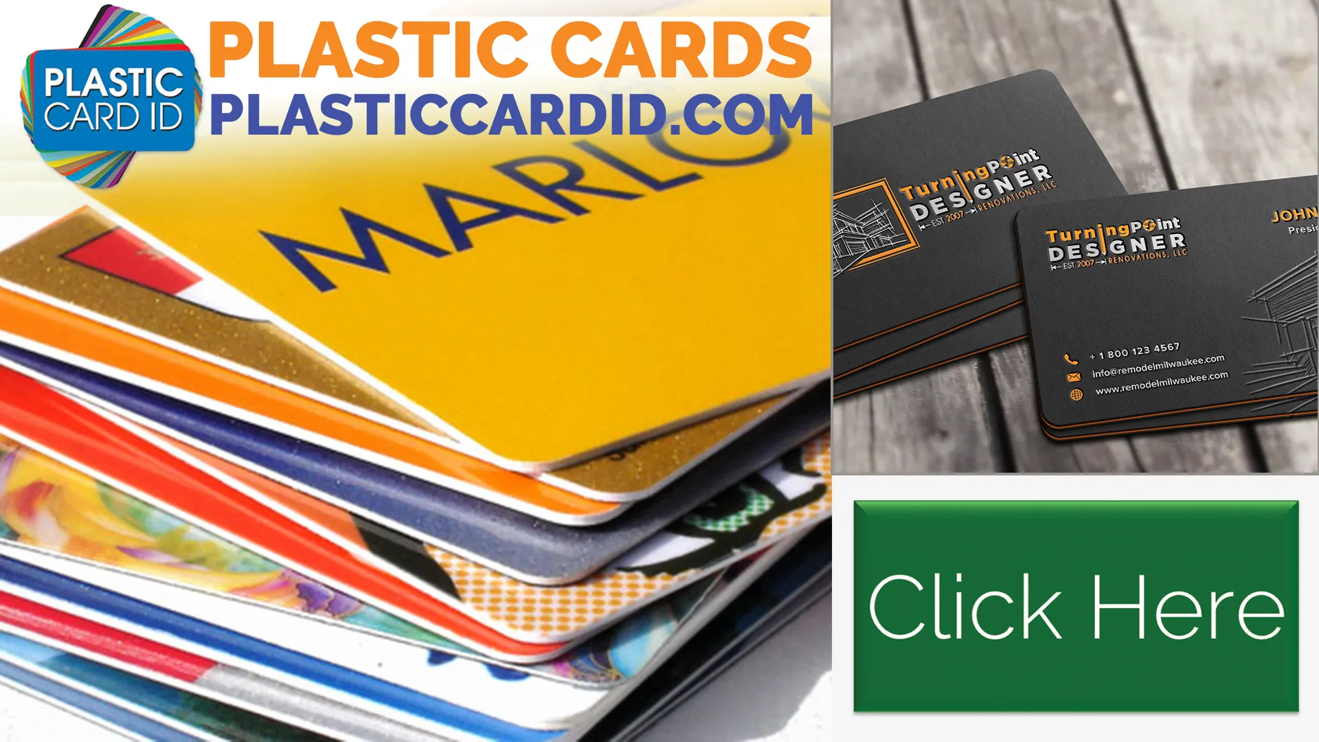
Click the image above to get started!
Using High-Quality Materials
The material of your business card says a lot about your brand. High-quality materials can leave a lasting impression and reflect your commitment to excellence.
Paper Quality
Choose thick, sturdy cardstock for your business cards. A more substantial card feels premium and can withstand wear and tear.
Various finishes like matte, gloss, or embossed can add a touch of sophistication. Test different options to see which aligns best with your branding.
- Gloss finish adds a shiny, upscale look.
- Matte finish offers a sleek, modern touch.
- Embossed elements emphasize key details.
Alternative Materials
Materials like plastic, metal, or even wood can make your card unique. These alternatives are eye-catching and can serve as conversation starters.
Though often more costly, alternative materials offer durability and a unique tactile experience that sets you apart.
Finishing Touches
Special features like rounded corners, edge painting, or foil stamping can add to the visual and tactile experience of your business card.
These small details can elevate the card's aesthetic appeal significantly, making it hard to forget.
Design Layout and Typography
The layout and typography of your business card play a vital role in its readability and overall aesthetic. Choosing the right layout and fonts can set you apart from the competition.
Easy-to-Read Fonts
Opt for fonts that are clean and easy to read. Avoid overly decorative fonts that may look good but are hard to decipher.
Use a mix of font sizes to create a visual hierarchy, guiding the reader's eye to the most important information first.
Effective Layouts
A well-organized layout can make a massive difference in how your card is received. Ensure that there's a logical flow from one piece of information to the next.
Experiment with different alignments to see what works best. Consistency in alignment can enhance the overall aesthetic appeal.
Text Hierarchy
Prioritize critical information using different font sizes and weights. Your name and job title should stand out, followed by your contact details.
This hierarchy ensures the essential details are seen first, making your card both functional and stylish.
Personalization and Branding
Personalization can make your business card truly unique and memorable. This not only sets you apart but also leaves a lasting impression on potential contacts.
Custom Logos and Graphics
Your logo is a crucial part of your branding. Ensure it's prominently displayed and is of high resolution to avoid looking pixelated.
Custom graphics that relate to your profession can also add a personal touch to your card, making it distinctively yours.
Unique Taglines
A catchy and memorable tagline can encapsulate your brand's message in a few words. This can make your card stand out and be easily recalled.
Choose a tagline that resonates with your target audience and reinforces your brand identity.
Client Testimonies or Quotes
If space permits, including a brief client testimony or a quote about your service can add credibility to your business card.
These real-world endorsements can go a long way in enhancing your card's impact.
Leveraging Unique Printing Techniques
Using cutting-edge printing techniques can make your business card truly exceptional. This attention to detail shows your commitment to quality and professionalism.
Letterpress
Letterpress printing gives a tactile, embossed effect that feels premium. It adds a touch of sophistication and class to your business card.
Though it's an older technique, it remains popular for its unique and distinguished look.
Foil Stamping
Foil stamping can add metallic touches to your card, making certain elements stand out. It's great for highlighting your name or logo.
This technique catches light beautifully and adds a luxurious feel to any business card.
Spot UV Coating
Spot UV coating applies a glossy finish to specific parts of your business card. This contrast can emphasize key elements such as your name or logo.
It's subtle yet visually appealing, making your business card more engaging.
Considering Cultural Elements
Considering cultural elements in your business card design can make a big difference, particularly if you work with international clients. Respect and consideration can set you apart as a thoughtful professional.
Language Options
Incorporate multiple languages if it suits your business model. This can make international clients feel more comfortable and valued.
Ensure that translations are accurate and professional to maintain your brand's integrity.
Symbols and Icons
Using culturally relevant symbols or icons can add a personal touch. However, it's crucial to ensure these elements are appropriate and respectful.
Research beforehand to avoid any cultural faux pas. Thoughtful details can strengthen international relations.
Localized Contact Details
If you operate in multiple regions, providing localized contact details can be beneficial. This includes phone numbers or local office addresses.
Localized information makes it easier for clients to reach out to you, enhancing their overall experience.
Eco-friendly and Sustainable Options

With the growing focus on sustainability, opting for eco-friendly business card materials and printing practices can show your commitment to the environment.
Recycled Materials
Using recycled paper or eco-friendly inks can make your business card an eco-friendly choice. This resonates well with environmentally conscious clients.
Often, these sustainable choices don't compromise on quality, making it a win-win situation.
Certifications and Claims
Add certifications or claims about the eco-friendliness of your business cards if applicable. These details reflect positively on your brand.
Certifications like FSC (Forest Stewardship Council) can add credibility and show your commitment to environmental responsibility.
Promoting Eco-friendly Practices
Your business card can also be a conversation starter for discussing your eco-friendly practices with potential clients. Highlighting this can set you apart.
This can attract like-minded clients and create more engaging networking opportunities.
Periodic Updates
Periodically updating your business card keeps it fresh and relevant. It shows you are evolving and staying updated with current trends.
Reassess Design Elements
Every couple of years, reassess your business card design. This helps to incorporate newer trends and maintain a modern appearance.
It's an opportunity to refine your card and make improvements based on feedback.
Update Contact Information
Make sure your contact information is always current. Outdated information can lead to missed opportunities and miscommunications.
Review your business card periodically to ensure all details are accurate and up-to-date.
Feedback and Audits
Seeking feedback from clients or peers about your business card can offer valuable insights. Audits help you identify areas for improvement.
Constructive feedback can lead to better design and more effective networking tools.
Get an Instant Quote
Visit PlasticCardID to get started!
Final Thoughts and Conclusion

Designing an effective and attractive business card involves a mix of creativity, practicality, and attention to detail. At Plastic Card ID, we aim to help marketing professionals create standout business cards that leave a lasting impression. For any queries or orders, feel free to reach us at 650-300-9340. Ready to make your mark? Let's get started!
Previous Page
Next Page