Design Tips for Florist Business Cards
Table of Contents []
- Designing Florist Business Cards
- Practical Design Tips for Creating Effective and Attractive Business Cards for Florists from Plastic Card ID
- Choosing the Right Colors
- Incorporating Floral Motifs
- Essential Contact Information
- Using QR Codes for Digital Portfolios
- Choosing the Right Card Material
- Creating a Professional Layout
- Choosing the Right Font
- Leveraging Blank Space
- Highlighting Unique Selling Points
- The Importance of a Logo
- Ensuring Print Quality
- Conclusion
Designing Florist Business Cards
Practical Design Tips for Creating Effective and Attractive Business Cards for Florists from Plastic Card ID

When it comes to first impressions, business cards can make a significant impact. For florists, having an eye-catching and informative card can help attract potential clients and grow your business. In this guide, we'll share practical tips for designing vibrant, professional, and effective business cards that stand out.
Choosing the Right Colors

Colors are one of the most critical elements in business card design. For florists, vibrant colors can help convey the essence of your floral services. Think about the colors that represent your brand and resonate with your target audience.
Vibrant and Florally Inspired
Florists thrive on creativity and vibrant colors. Utilize shades that reflect the beauty of nature and your floral arrangements. Bright flowers like red roses or sunflowers can translate into striking card designs.
Choosing colors from nature not only makes your card visually appealing but also aligns it with the theme of your business. This enhances the overall impact your card has on potential clients.
Color Psychology
Understanding color psychology can also be beneficial. For example:
- Red: Represents passion and love.
- Green: Symbolizes growth and stability.
- Yellow: Implies happiness and positivity.
By incorporating these colors into your business card, you'll create a more meaningful connection with your audience.
Incorporating Floral Motifs

Floral motifs can make your business card more visually appealing and aligned with your services. They can be used as borders, backgrounds, or central images.
Design Elements
Adding floral elements doesn't necessarily mean overloading the card. Use subtle, elegant motifs that enhance the card's professional look without making it too busy.
Consider using icons of flowers or leaves as part of your design. These elements should complement the overall color scheme and layout rather than overwhelm the card.
Thematic Consistency
Your business cards should reflect your brand's theme. If your focus is on exotic flowers, consider using motifs that represent them. This creates a cohesive brand image and helps clients remember you.
Consistency across all marketing materials, including business cards, is key to brand recognition.
Essential Contact Information

Including the necessary contact information is crucial. This should be clear and easy to read so that potential clients can reach out without any confusion.
What to Include
Some critical pieces of contact information to incorporate are:
- Your Name
- Business Name
- Phone Number
- Email Address
- Website
- Social Media Handles
Having this information prominently displayed ensures that your clients have multiple ways to contact you.
Clarity and Readability
The font size, style, and color should make the contact info readable. Avoid overly decorative fonts for essential information.
Keep the text simple and clean, ensuring that your clients don't struggle to read the details.
Using QR Codes for Digital Portfolios

QR codes can be a great addition to your business card. They provide easy access to digital portfolios and more information about your services.
Adding QR Codes
A QR code can bring clients directly to your website, portfolio, or social media. It modernizes your business card and shows clients you're tech-savvy.
Ensure the QR code is prominent but not distracting. Place it in a corner where it's easily noticeable.
Benefits
Here's why QR codes are beneficial:
- Convenience: Clients can scan and access your info instantly.
- Engagement: It creates a more interactive experience.
- Space Saver: Allows you to include more information without cluttering the card.
Choosing the Right Card Material

The material of your business card can say a lot about your brand. While there are various options, choosing the right one is essential.
Types of Materials
Common materials include:
- Paper: Classic and versatile.
- Plastic: Durable and modern.
- Metal: Unique and premium.
Your choice depends on the impression you wish to create. Plastic cards are durable and can withstand the rigors of daily handling better than paper.
Sustainability
If sustainability is important to your brand, consider using recycled or eco-friendly materials. This aligns with a growing preference for environmental consciousness among consumers.
Clients appreciate businesses that care about the environment, and using sustainable materials can set you apart.
Creating a Professional Layout

A well-organized layout enhances the card's visual appeal and readability. Balance is key in designing an effective business card.
Balancing Elements
Ensure that your text, logo, and any other elements are well-spaced. Avoid clutter and maintain a clean, professional look.
The goal is to make the card easy to read and aesthetically pleasing. Too many elements can be overwhelming and distracting.
Alignment and Symmetry
Proper alignment and symmetry help in maintaining the aesthetic. Align text and images to create a harmonious appearance.
This makes the card more visually engaging and professional.
Choosing the Right Font

The font you use can alter the perception of your business card. It should be stylish but readable.
Font Style
Choose a font that aligns with your brand's identity. For florists, a script or serif font might evoke the elegance associated with flowers.
Avoid overly elaborate fonts that can hinder readability. Your contact information should be clear and accessible.
Font Size
Use a font size that's legible. Important details like your name and contact information should stand out.
Maintaining readability is keyensure the font size is neither too small nor too large.
Leveraging Blank Space
Don't be afraid to utilize blank space effectively. It's an essential part of good design, preventing the card from looking cluttered.
Importance of Blank Space
Blank space helps to create a balanced and aesthetically pleasing card. It makes the elements on the card stand out more.
A well-spaced card is more professional and easier to read, making it more effective for networking.
Visual Breathing Room
Blank spaces provide breathing room for the eyes. It ensures that the card doesn't become overwhelming for the viewer.
This enhances readability and retention of the information on the card.
Highlighting Unique Selling Points

Your business card should communicate what sets you apart. Highlighting your unique selling points can attract more clients.
Prominent Features
Include any unique services you offer, such as exotic flowers or same-day delivery. Make this information prominent.
Highlighting unique aspects of your service can intrigue potential clients and make your card memorable.
Customer Testimonials
Adding a brief testimonial can also be impactful. It provides social proof and increases credibility.
Satisfied customer reviews can be very persuasive and draw more clients to your business.
The Importance of a Logo

A logo is a visual representation of your brand. Including a well-designed logo on your business card is essential for brand recognition.
Designing the Logo
Your logo should be simple, memorable, and reflective of your brand. For a florist, incorporating floral elements can be effective.
Ensure that the logo is high-quality and scalable so it looks good in any size.
Placement
Place the logo prominently on the card, usually at the top center or top left. It should be immediately noticeable but not overpowering.
A well-placed logo increases recognition and gives a professional touch to your business card.
Ensuring Print Quality

The quality of the print can make or break your business card. It's essential to ensure that the print is clear and high-quality.
Choosing the Best Printer
Select a reliable printer that uses high-quality materials and techniques. A professional print ensures that colors and details are sharp and vibrant.
Quality printing enhances the overall look of the card and makes a good impression.
Proofing
Always proof your design before printing. Check for any errors in text or layout to avoid costly mistakes.
A thorough proofing process can save you time and money and ensures the final product is perfect.
Get an Instant Quote
Visit PlasticCardID to get started!
Conclusion
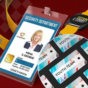
By following these tips from Plastic Card ID, you'll be well on your way to creating stunning and effective business cards for your floral business. From choosing the right colors and motifs to incorporating essential contact information and QR codes, each element plays a crucial role. Don't forget to invest in quality materials and print to leave a lasting impression on potential clients.
If you're ready to design your perfect business card, or if you have any questions, don't hesitate to reach out to us. Contact Plastic Card ID now at 650-300-9340! We're here to help create cards that enhance your professional image and networking efforts.
Previous Page
Next Page

