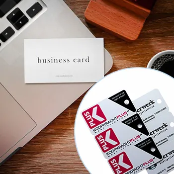
Design Tips for Lawyer Business Cards
Table of Contents []
- Designing Lawyer Business Cards
- Plastic Card ID Provides Practical Design Tips for Creating Effective and Attractive Business Cards for Lawyers
- Professional Color Schemes
- Legal Motifs
- Essential Contact Information
- Incorporating Features Like QR Codes
- Typeface and Typography
- Logo and Branding Elements
- Finishing Touches
- Template vs. Custom Design
- Usability and Practicality
- Leveraging Double-sided Printing
- Personalization
- Design Tools and Resources
- Plastic Card ID - Your Go-to Solution for Professional Business Cards
Designing Lawyer Business Cards
Plastic Card ID Provides Practical Design Tips for Creating Effective and Attractive Business Cards for Lawyers
If you're a lawyer, having a well-designed business card is essential to making a strong professional impression. At Plastic Card ID, we understand the elements that make a lawyer's business card effective and attractive. From professional color schemes and legal motifs to including essential contact information and innovative features like QR codes, we've got you covered. Our tips will help you create business cards that enhance your professional image and networking efforts. For new orders or any questions, you can reach Plastic Card ID easily at PHONE.
Professional Color Schemes
Choosing the right color scheme for your business card is vital for conveying professionalism. Elegant and muted colors like navy blue, black, and grey often work best for legal professionals.
The Psychology of Colors
Colors can invoke different emotions and perceptions. For instance, blue is often associated with trust, stability, and professionalism, making it an excellent choice for a lawyer's business card.
Black exudes sophistication and authority, while grey offers a neutral and balanced look. Understanding the psychology behind colors can help you make informed decisions when designing your card.
Balancing Colors
The key to a professional look is balance. Avoid overly vibrant or clashing colors. Instead, opt for a primary color combined with an accent color for a clean, polished appearance.
Consider using a simple color palette to maintain a refined and professional appearance. A well-balanced color scheme ensures that your card is easy on the eyes but still stands out.
Using Brand Colors
If your law firm has established brand colors, incorporating them into your business card design can help reinforce your firm's brand identity. Consistent use of colors fosters recognition and trust.
Be mindful of integrating brand colors in a subtle and tasteful manner to avoid making the card too busy or distracting.
Legal Motifs
Integrating legal motifs can visually convey the nature of your profession. Subtle designs like scales of justice, a gavel, or law books can add a touch of professionalism without being overwhelming.
Choosing the Right Motifs
Select motifs that align with your practice area. For example, scales of justice are universal symbols representing fairness and impartiality, making them suitable for any legal professional.
Ensure that the motifs complement rather than clutter your card. Simple, elegant designs are more likely to be effective.
Placement and Size
Proper placement and size of these motifs can enhance the overall design. Small icons in the corner or a faint watermark in the background work well.
Avoid making these elements too dominant. The focus should remain on the essential information and your professional image.
Subtlety is Key
While it's tempting to use bold graphics, subtle designs generally look more professional. Consider minimalist motifs that add a touch of class without distracting from the main content.
Remember, your business card is a tool for first impressions. Keeping the design understated and elegant speaks volumes about your sense of professionalism.
Essential Contact Information
Your business card should include all the necessary contact information to ensure potential clients can easily reach you. This includes your name, title, phone number, email address, and office address.
Name and Title
Clearly display your full name and professional title. This immediately informs recipients of who you are and your role within the firm.
For example, use titles like Attorney at Law' or Legal Advisor' to convey your expertise. This helps establish your professional identity right away.
Phone Number and Email
Include a phone number where you can be directly reached. Make sure the number is accurate and regularly monitored. Emails are a crucial connection point, so provide a professional email address.
Avoid using personal emails. Instead, opt for an email associated with your law firm or practice to maintain professional consistency.
Office Address
Offering a physical address adds legitimacy to your card and gives clients a location to visit or send documents. Ensure the address is clear and formatted correctly.
If you have multiple office locations, list the main office or include a brief note indicating other locations are available.
Incorporating Features Like QR Codes
In the digital age, integrating features like QR codes on your business card can significantly enhance its functionality. QR codes provide easy access to digital portfolios, websites, or contact information.
Benefits of QR Codes
QR codes offer a bridge between physical and digital communication. They provide an easy way for potential clients to access your online resources with a simple scan.
This can include links to your website, a digital portfolio, or even a vCard that can be directly added to their contact list.
Design and Placement
When incorporating QR codes, ensure they blend seamlessly into the design. Place the QR code in a location that doesn't overshadow key information but is still easy to find.
Consider the size and color of the QR code to maintain the card's overall aesthetics. A small, unobtrusive QR code in a corner can be effective and professional.
Ensuring Functionality
Before printing, test the QR codes to ensure they work correctly. A malfunctioning QR code reflects poorly on your professionalism.
Making sure the QR code leads to useful and informative content can enhance your card's value, adding convenience and value for your clients.
Typeface and Typography
The typeface and typography you choose are crucial for readability and aesthetic value. They should reflect professionalism while ensuring all information is easy on the eyes.
Choosing the Right Font
Select fonts that are clean and easy to read, such as Times New Roman, Arial, or Helvetica. These fonts exude professionalism and are widely accepted in the business world.
Avoid using overly decorative fonts. Simple and straightforward fonts maintain clarity and ensure readability.
Font Size and Hierarchy
Proper font size is essential for readability. Your name and title should be slightly larger, making them stand out, while other details can be smaller but still legible.
Hierarchy helps direct the reader's attention to the most critical information first. Use different font sizes to create a visual structure.
Consistent Typography
Consistency in typography is key. Stick to one or two fonts throughout the card to maintain a cohesive look.
Mixing too many fonts can create confusion and disrupt the card's professional appearance.
Get an Instant Quote
Click the image above to get started!
Logo and Branding Elements
Your law firm's logo is a significant element of your business card. It represents your brand and helps with recognition and professional appearance.
Placement of Logo
The logo should be prominently placed but not overpowering. Placing it at the top or in a corner ensures it's visible while leaving space for other essential details.
Avoid placing the logo in the center, as it can disrupt the flow of information. Elegantly positioned logos aid in brand reinforcement.
Logo Size
The size of the logo should be balanced. It should be large enough to be recognizable but not dominate the card. A balanced approach ensures all elements are harmonious.
Consider resizing the logo to match the card's overall design and other graphical elements, ensuring a cohesive look.
Consistency in Branding
Use the same logo and branding elements across all your business materials. Brand consistency enhances recognition and trust.
This applies to colors, fonts, and motifs. A unified approach strengthens your brand identity and professional image.
Finishing Touches
Finishing touches can elevate your business card from good to great. These include the choice of card stock, finish, and any additional features like embossing or foil stamping.
Card Stock
Choose a high-quality card stock for a sturdy and professional feel. Thicker card stock conveys quality and durability, making a strong impression.
Avoid flimsy paper as it may convey a lack of professionalism. Investing in quality card stock can significantly impact how you are perceived.
Finishes
Consider matte or glossy finishes depending on your personal preference and brand image. Matte finishes offer a sophisticated, understated look, while glossy finishes can provide a vibrant and modern feel.
Think about how the finishes will affect the visibility of text and motifs on the card.
Special Features
Embossing, debossing, and foil stamping can add an extra layer of sophistication. These features provide a tactile experience, enhancing how recipients perceive your card.
Use these features sparingly to maintain elegance and avoid creating a cluttered look.
Template vs. Custom Design

Deciding between a template and a custom design depends on your specific needs and budget constraints. Both options have their advantages.
Using Templates
Templates are cost-effective and provide a quick solution for creating business cards. They come in various styles, allowing you to choose one that matches your brand.
However, templates may lack uniqueness. Ensure the template you choose reflects your professionalism and stands out.
Custom Designs
Custom designs offer more flexibility and uniqueness. You can work with designers to create a card that perfectly represents your brand and professional image.
While more expensive, custom designs can provide a distinct advantage in terms of originality and tailored fit.
Weighing the Options
Consider your budget, time, and the impression you wish to convey. If you have the resources, a custom-designed card can have a more significant impact.
Otherwise, well-chosen templates can also serve you well, especially when professionally printed and finished.
Usability and Practicality

Aside from aesthetics, your business card should be practical and easy for recipients to use. This includes ensuring all contact information is clear and the card fits typical business card holders.
Readable Content
Ensure that all text is easily readable. Avoid cramped layouts and maintain enough white space to make reading information effortless.
Clear content enhances usability, ensuring that your contact details are easily accessible to potential clients.
Standard Sizes
Stick to standard business card dimensions. Non-standard sizes may have aesthetic appeal but can be inconvenient for recipients to carry and store.
Standard sizes ensure your card fits in wallets, cardholders, and business card organizers, enhancing practicality.
Durability
Choose durable materials and finishes to ensure your business card can withstand wear and tear. This reflects on your professional reliability.
A well-maintained business card continues to serve as a point of contact and a reminder of your services long after the initial meeting.
Leveraging Double-sided Printing

Double-sided printing can maximize the space on your card, offering more room for additional information or design elements without cluttering the front.
Front and Back Design
Use the front for primary details like your name, title, and contact information. Reserve the back for secondary information, such as your logo, website, or QR code.
This approach maintains a clean, professional look while providing extra information.
Additional Information
Consider including secondary information on the back, such as office hours, social media handles, or brief service descriptions.
This ensures that critical details are immediately visible, while additional information is still accessible without overcrowding the primary view.
Maintaining Balance
Even with double-sided printing, maintain a minimalist approach. Too much information can overwhelm and defeat the purpose of the extra space.
Keep it balanced and focused on essential details to preserve an elegant and readable design.
Personalization

Adding a personal touch can make your business card memorable. Consider features like personalized messages, distinctive illustrations, or custom graphics.
Handwritten Notes
Including a space for a handwritten note can add a personal touch, showing clients that you value them individually.
This can be particularly impactful when networking, as it creates a personal connection and leaves a lasting impression.
Unique Graphics
Commission unique illustrations or graphics that represent your professional identity. Distinctive visuals can make your card stand out from the crowd.
A custom-designed graphic can contribute to a memorable and engaging business card without compromising professionalism.
Signature Elements
Adding signature elements, like a personal logo or a unique motif, can create a sense of exclusivity and personal branding.
This differentiates your card and reinforces your professional identity, making it easier for clients to remember you.
Design Tools and Resources

Using the right tools and resources can simplify the process of creating an attractive and effective business card.
Design Software
Design software like Adobe Illustrator, Photoshop, or online tools like Canva offer templates and features to create professional business cards.
These tools provide flexibility and enable you to customize your design to fit your brand and preferences.
Professional Designers
If you prefer a hands-off approach, consider hiring a professional designer. They bring expertise and creativity, ensuring your business card is polished and effective.
Working with designers can provide insights and suggestions that enhance your card's overall appeal and functionality.
Printing Services
Partner with reputable printing services to ensure high-quality business cards. Services like Plastic Card ID can handle everything from design consultation to final print.
Professional printing services ensure your cards are printed on high-quality materials and finished to perfection.
Get an Instant Quote
Visit PlasticCardID to get started!
Plastic Card ID - Your Go-to Solution for Professional Business Cards

By following these practical design tips, you can create business cards that enhance your professional image and networking efforts. At Plastic Card ID, we offer comprehensive solutions for creating effective and attractive business cards for lawyers. From selecting professional color schemes and legal motifs to including essential contact information and innovative features like QR codes, we've got you covered. Contact Plastic Card ID today at PHONE for your business card needs.
Remember, a well-designed business card is a powerful tool in building your professional network and leaving a lasting impression. Trust Plastic Card ID to help you achieve that perfect balance of elegance, functionality, and professionalism.
Previous Page
Next Page