Design Tips for Hospitality Business Cards
Table of Contents []
- Designing Hospitality Business Cards
- Designing Memorable Hospitality Business Cards with Plastic Card ID
- Color Schemes Matter
- Typography Makes a Difference
- Perfect Logo Placement
- Adding Unique Features: QR Codes and NFC Technology
- Materials Matter
- Adding a Personal Touch
- Layering in Functional Elements
- Finishing Touches That Impress
- Effective Information Presentation
- Examples of Well-Designed Cards
- Conclusion: Elevate Your Hospitality Business Cards with Plastic Card ID
Designing Hospitality Business Cards
Designing Memorable Hospitality Business Cards with Plastic Card ID

Your business card is often the first impression a potential client gets of your hospitality business. It's not just a piece of paper - it's your calling card, your introduction, and your chance to impress. At Plastic Card ID, we're here to guide you through creating effective and attractive hospitality business cards.
Color Schemes Matter
Color schemes can make a huge difference in the appeal and effectiveness of your business card. The right colors can evoke feelings, highlight important information, and represent your brand effectively. %NICKNAME% will show you how to choose the best colors.
Choosing the Right Colors
Colors can convey different emotions and messages. For instance, blue often represents trust and professionalism, while green can signify growth and sustainability. Picking colors that align with your brand's message is key.
Think about what you want potential clients to feel when they see your card. A luxurious hotel might lean towards deep reds and golds, while a beachside resort might choose blues and greens. Plastic Card ID can help you figure out the best combination.
Color Consistency with Branding
Your business card should reflect your overall brand identity. That means using the same colors as your logo and other marketing materials. Consistency helps build brand recognition!
If your website and brochures are purple and gray, make sure your business card follows suit. This way, clients will quickly associate your materials with your hospitality business.
Practical Tips on Color Usage
- Limit your color palette to 2-3 colors to avoid a cluttered look.
- Use contrasting colors for text to improve readability.
- Test print your design to ensure colors look good in print as they do on screen.
Typography Makes a Difference
Let's talk about fonts and text! The right typography can make your business card easy to read and visually appealing. At Plastic Card ID, we know a thing or two about typographic choices and how they can impact your card's effectiveness.
Font Selection
Picking the right fonts is crucial. You want something classy and easy to read. Using too many fonts can be overwhelming, so it's best to stick with just one or two complimentary fonts.
Your chosen fonts should align with your brand's personality. For example, modern sans-serif fonts work well for a chic, contemporary hotel, while elegant serif fonts might suit a historic inn.
Font Sizes and Layout
The size of the text is just as important as the type of font. You don't want your clients squinting to read your information. Keep the main text sizes between 10-12pt, with your business name larger, around 14-16pt.
Be mindful of the text layout. Space things out well, leaving enough white space so the card doesn't feel crowded. Clear organization helps the reader follow the information easily.
Tips for Effective Typography
- Avoid overly decorative fonts that are hard to read.
- Maintain hierarchy by varying font sizes for different pieces of information.
- Ensure good contrast between text color and background color.
Perfect Logo Placement
Your logo is a symbol of your brand's identity, so its placement on your business card is critical. Plastic Card ID will help you understand where and how to place your logo for maximum impact!
Top or Bottom?
The top-left corner is a classic place for logos, providing immediate recognition. However, depending on your logo's shape and design, it might also look fantastic at the center or even the bottom corner.
You want your logo to be one of the first things people see, so consider placement carefully. We can help you find the most suitable spot for it!
Size Matters
The size of your logo should be proportional to the rest of your card. It shouldn't overpower the text but also shouldn't be so small that it gets lost. A good rule is for your logo to be around 25-30% of your card's surface area.
If you're unsure, mock up a few different designs and get feedback. Sometimes, a second opinion can make all the difference!
Blending Logo and Design
- Ensure your logo color scheme matches or compliments the card's design colors.
- Allow enough white space around your logo.
- Consider using raised print for your logo for extra impact.
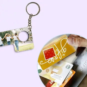
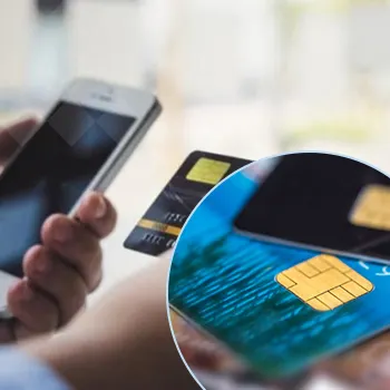
Adding Unique Features: QR Codes and NFC Technology
Take your hospitality business cards to the next level by incorporating unique features like QR codes or NFC technology. These modern additions can enhance the functionality and impress your clients.
Why Use QR Codes?
QR codes can link directly to your website, booking system, reviews, or a special landing page. They are easy to scan with any smartphone and provide a direct digital connection to your services.
Think about what information you want to share. QR codes are perfect for sharing menus, event details, or special offers. It's a simple but effective way to provide more information without cluttering up your card.
Incorporating NFC Technology
NFC (Near Field Communication) allows for instant connection when someone taps their phone to your business card. It can be programmed to trigger various actions, such as opening a website or saving contact details.
NFC technology is a bit more advanced but can really wow your clients. It's perfect for businesses looking to impress with their tech-savviness and innovation.
Tips for Implementation
- Ensure QR codes are large enough to scan easily.
- Test NFC tags thoroughly to ensure they work flawlessly.
- Keep the design around these elements clean and straightforward.
Get an Instant Quote
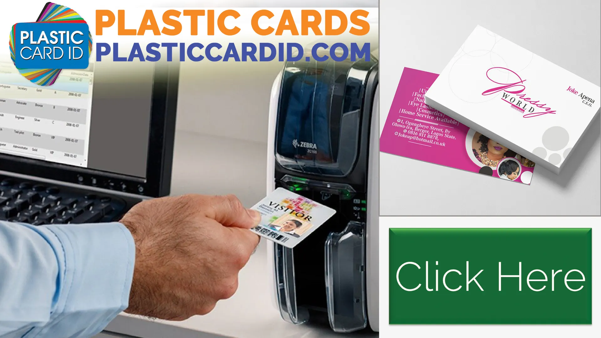
Click the image above to get started!
Materials Matter
The material you use for your business card can say a lot about your hospitality business. At Plastic Card ID, we offer a variety of materials to suit different needs and budgets.
Choosing the Right Material
Standard cardstock is a good option for most uses, but you might consider premium options like plastic or metal if you want to stand out. Each material has its pros and cons.
Think about the impression you want to create. A thick, glossy card can convey luxury, while a sleek, matte card might feel more modern and professional. We can help you figure out which material is best for your brand.
Eco-Friendly Options
Many hospitality businesses are making the shift to eco-friendly options. Recycled paper or biodegradable materials can show your commitment to sustainability.
Clients appreciate when businesses are environmentally conscious. If this aligns with your values, consider highlighting your material choice on the card itself!
Durability and Feel
- Test different materials to see which feels best in hand.
- Consider how the material affects perceived value.
- Think about practicalities like writing on the card or cleaning it if it gets dirty.
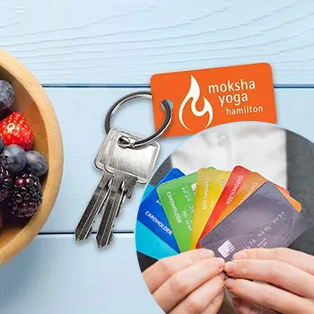
Adding a Personal Touch
Personalization can make your business card even more memorable. Plastic Card ID offers several ways to add a personal touch without over-complicating the design.
Foil Stamping
Foil stamping adds an extra layer of elegance and professionalism. Whether it's gold, silver, or another color, foil stamping can make key elements of your card stand out.
It's a great way to draw attention to your logo, business name, or other important information. Simple yet impactful!
Handwritten Elements
Handwritten notes or signatures can give a personal touch to your card. This can be especially effective in the hospitality industry, where personal connections are critical.
Consider leaving a small space where you can jot down a quick note or signature. Clients will appreciate the extra effort.
Custom Shapes
- Die-cut cards in unique shapes.
- Folded cards for more information or a mini brochure feel.
- Interactive elements like pull tabs or spinners.
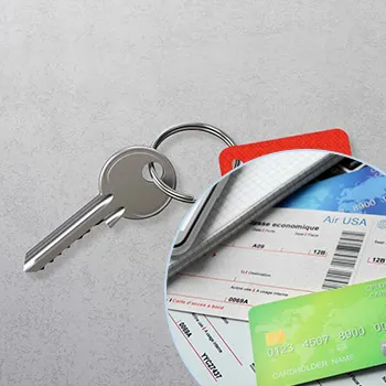
Layering in Functional Elements
Beyond QR codes and NFC, there are other functional elements you can include in your card's design. Plastic Card ID has the know-how to help you incorporate these extras effectively.
Interactive Features
How about adding a mini-map to guide clients to your location? Or inserting a calendar of events? Interactive elements make your card more useful and engaging.
Think creatively about what your clients would find valuable. Interactive features can be a great way to provide additional information in a fun, useful way.
Foldable Designs
A foldable card gives you more space to work with. This can be particularly useful if you have a lot of information to share, like multiple locations or a detailed service list.
Just be sure the fold doesn't make the card too bulky or awkward to carry. A well-designed foldable card should still be pocket-friendly!
Augmented Reality
- Create an AR experience linked to your card.
- Use apps to bring your card to life with digital elements.
- Showcase videos, 3D tours, or interactive content.
Finishing Touches That Impress
The finishing touches can make all the difference in transforming a good business card into a great one. Plastic Card ID offers various finishing options to give your card that extra edge.
Embossing and Debossing
Embossing (raising the design) and debossing (pressing the design into the card) add texture and a tactile element to your card. They can highlight important parts of your design, like your logo or company name.
This subtle touch of luxury can impress clients and make your card stand out in a sea of plain cards.
Lamination Options
Lamination can protect your card from wear and tear while also giving it a unique feel. Matte lamination offers a sophisticated, non-glossy finish, while glossy lamination makes colors pop and adds shine.
Consider what impression each type of lamination gives and choose the one that best aligns with your brand image.
Spot UV Coating
- Adds a glossy highlight to specific areas.
- Perfect for emphasizing logos or key information.
- Creates a striking contrast with matte finishes.
Effective Information Presentation
How you present the information on your business card can make a big difference in its effectiveness. At Plastic Card ID, we recommend best practices for making sure all essential details are clear and easy to find.
Information Hierarchy
Organize the information on your card so that the most important details stand out right away. Typically, this includes your name, your business name, and contact information.
Use font size, bolding, and positioning to create a clear hierarchy. Clients should be able to see at a glance who you are, what you do, and how to reach you.
Essential Contact Details
Include all necessary contact information, such as phone number (%PHONE%), email, and physical address if relevant. Make sure this information is easy to read and well separated from other elements.
If you use social media for business, consider adding those handles too. Just make sure not to overcrowd the card with too much text.
Best Practices for Clarity
- Use bullet points to list services or features.
- Avoid long paragraphs of text.
- Use icons to save space and add visual interest.
Examples of Well-Designed Cards
Seeing examples of well-designed cards can inspire you and give you a sense of what works well. Plastic Card ID has a portfolio of stunning hospitality business cards to share with you.
Luxury Hotel Cards
Luxury hotels often use thick, high-quality cardstock with metallic finishes and elegant fonts. The design is generally minimalist yet striking, focusing on a sophisticated color palette.
Key features might include debossed logos and gold or silver foil details. These elements convey the hotel's high-end status and attention to detail.
Charming B&B Cards
Bed and Breakfast business cards might be more whimsical and personal. Think hand-drawn illustrations, warm color schemes, and playful fonts that reflect the cozy, welcoming nature of a B&B.
These cards often include personal touches like a handwritten thank-you note space or unique shapes reflecting the property's character.
Modern Resort Cards
- Use of bold colors and modern fonts.
- Incorporation of digital features like QR codes.
- Sleek, minimalistic design with clear, readable text.
Get an Instant Quote
Visit PlasticCardID to get started!
Conclusion: Elevate Your Hospitality Business Cards with Plastic Card ID
Your business card is a powerful tool for making a lasting impression. By focusing on color schemes, typography, logo placement, and unique features, you can create a card that not only looks good but also functions effectively.
Plastic Card ID is here to help you through this process. We offer a variety of options and expert guidance to make sure your business cards are as impressive as your hospitality services. Call us today at %PHONE% to start working on your perfect business card!
Create a stunning, memorable business card with Plastic Card ID and leave a lasting impression on your clients. Your success is our mission, so let's design the perfect card together!
Previous Page