Design Tips for Health and Wellness Business Cards
Table of Contents []
- Designing Health and Wellness Business Cards
- Creating Perfect Business Cards for Health and Wellness Professionals
- Importance of Soothing Color Schemes
- Incorporating Wellness Motifs
- Inclusion of Essential Contact Information
- Incorporating QR Codes
- Utilizing High-Quality Materials
- Emphasizing Branding with Logos and Taglines
- Ensuring Readability and Clarity
- The Final Touch: Proofreading
- Work with Professionals at Plastic Card ID
Designing Health and Wellness Business Cards
Creating Perfect Business Cards for Health and Wellness Professionals
Designing a business card for health and wellness professionals isn't just about getting your name and number out there. It's about making a lasting impression. At Plastic Card ID, we understand that your business card should reflect your professional image. Let's dive into some practical design tips to help you create effective and attractive business cards.
Importance of Soothing Color Schemes
Choosing the right color scheme is crucial. Soothing colors like soft blues, greens, and pastels can evoke a sense of calm and peace, which aligns well with the health and wellness industry. Your card should invite relaxation and trust at first glance.
Benefits of Soft Colors
Using soft colors has several benefits, especially in the health and wellness field. Such colors create a serene and relaxing atmosphere. This aligns perfectly with the services you offer.
Imagine handing out a card that instantly puts your clients at ease. Soft colors can do just that. Not only do they make your card stand out, but they also resonate with your brand.
Additionally, soft colors are visually appealing without being overwhelming. They create a balance between professionalism and approachability.
How to Choose the Right Color
When selecting a color scheme, consider your brand identity. If your brand is associated with nature and healing, green might be the best choice. For a more clinical approach, soft blues can work wonders.
Don't forget to test your colors. Print a few samples and see how they look in real life. Sometimes, colors on a screen don't look the same on a printed card.
- Consider your target audience
- Align colors with your brand values
- Test before finalizing
Combining Colors Effectively
Mixing colors can be tricky. You don't want your card to look too busy. Stick to one or two main colors and use accent colors sparingly. This keeps your design clean and professional.
Use contrasting colors for text to ensure readability. Light text on a dark background or vice versa works best. Avoid overly bright or dark combinations that strain the eyes.
Incorporating Wellness Motifs
Symbols and motifs can enhance the visual appeal of your business card. For health and wellness pros, think about using elements like leaves, trees, or even water droplets. These symbols signify growth, health, and tranquility.
Using Nature Elements
Natural elements can create an instant connection with clients. A simple leaf or tree symbol can convey your commitment to natural and holistic health practices. These symbols are universally understood and appreciated.
Consider subtle motifs rather than overwhelming designs. Small icons or faint, watermark-like images can add a touch of elegance without overpowering your card.
Professional Graphics
If nature motifs aren't your thing, consider using sleek, professional graphics. Patterns that symbolize balance and tranquility, like mandalas or waves, can work wonders. Choose designs that complement your overall branding.
Graphics should enhance, not distract. Make sure they are tasteful and relevant to your services.
- Keep designs simple and minimal
- Ensure graphics are high resolution
- Use motifs that align with your brand
Consistency with Brand Identity
Your business card is an extension of your brand. Make sure every design element aligns with your overall brand identity. Consistency helps build trust and recognition among clients.
Use similar motifs and graphics on your website and other marketing materials. This creates a cohesive brand experience.
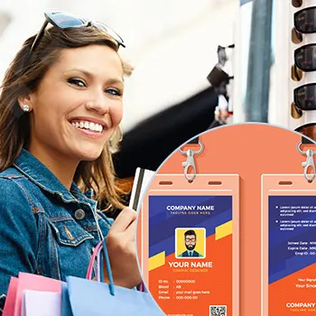
Inclusion of Essential Contact Information
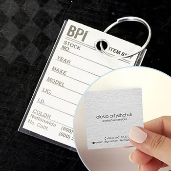
What's a business card without contact details? Essential information like your name, title, phone number, email, and website should be clearly visible. Don't make people search for your contact info.
Prioritizing Information
Start with the most important details: your name and title. This helps recipients instantly know who you are and what you do. Follow with your contact information: phone number, email, and website.
Make sure your text is legible and easy to read. Avoid using overly fancy fonts that can cause confusion.
- Font size should be readable
- Avoid cluttered designs
- Stick to essential information
Creating a Hierarchy
Not all information is equally important. Make your name and title stand out by using a slightly larger or bolder font. This helps create a visual hierarchy that guides the reader's eyes naturally.
Use spacing and font styles to differentiate between various pieces of information. For instance, your phone number and email can be in a different font style than your name and title.
Balancing White Space
A good amount of white space can make your card look modern and professional. Don't cram too much information into a small space. White space helps to highlight the essential details and makes the card more readable.
Keep it simple. Sometimes, less is more.
Get an Instant Quote
Click the image above to get started!
Incorporating QR Codes

QR codes are a brilliant addition to modern business cards. They allow clients to access your digital portfolio with a simple scan. It's a perfect blend of traditional and digital marketing.
Setting Up Your QR Code
Generating a QR code is easy. Websites like QR-Code-Generator.com offer free tools to create your own. Link the QR code to a page that showcases your services, portfolio, or even a booking form.
Ensure the URL is correct before printing your QR codes. Broken links can frustrate potential clients and harm your professional image.
Positioning the QR Code
Placement matters. The back of your business card is often the best spot for a QR code. Make sure it's not too close to the edges to prevent it from being cut off or distorted.
- Ensure scannability
- Keep it clear of other graphics
- Test it before mass printing
Benefits of QR Codes
Adding a QR code can make your card stand out. It shows that you're tech-savvy and up-to-date with modern trends. Clients appreciate the convenience of easily accessing more information.
QR codes can link to various resources, such as:
- Your digital portfolio
- Booking forms
- Client testimonials
- Service descriptions
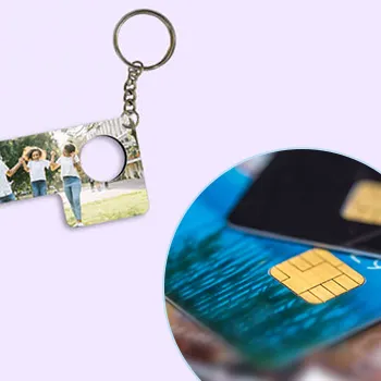
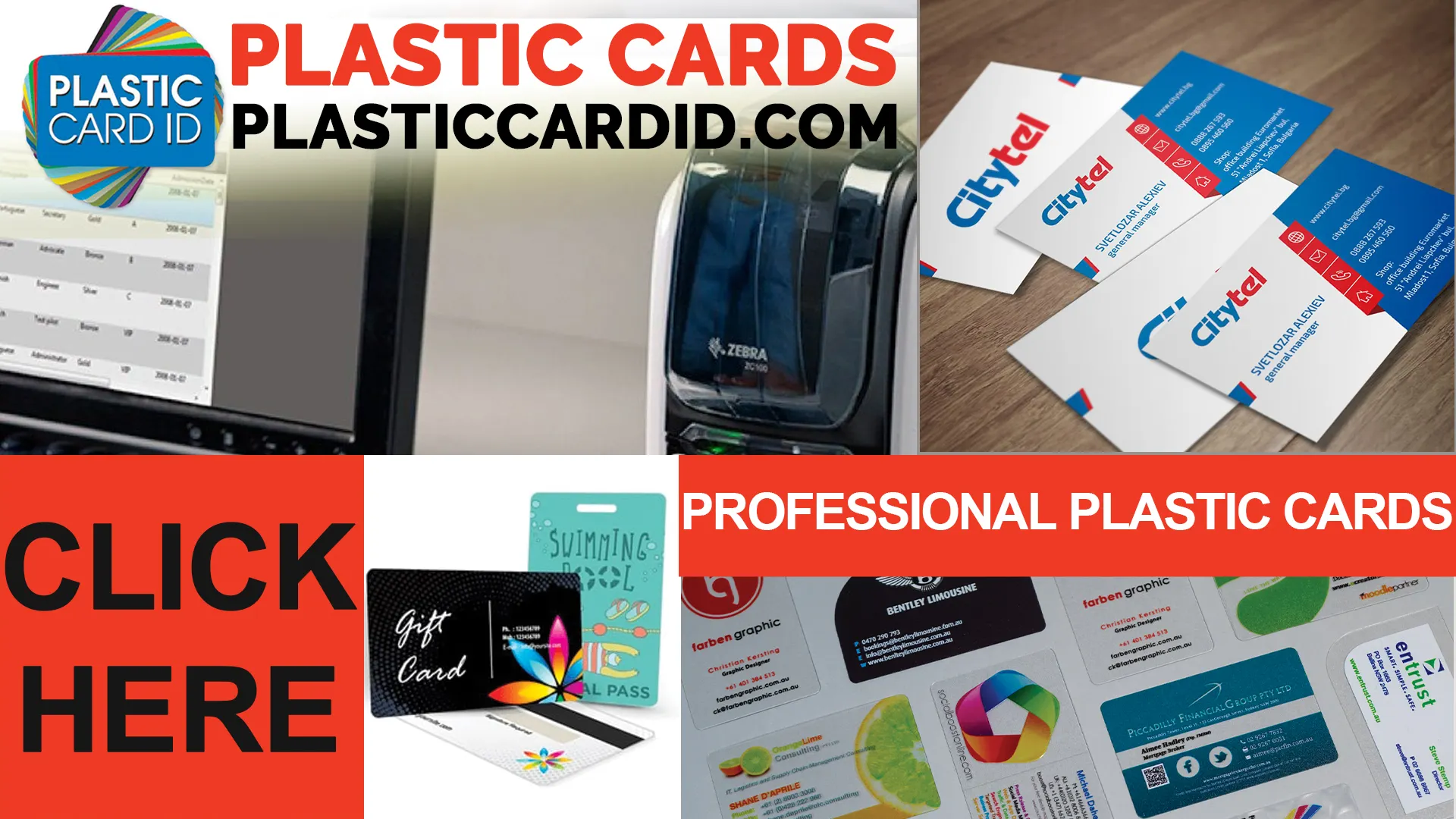
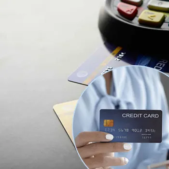
Utilizing High-Quality Materials
The feel of your business card matters. Using high-quality materials can make your card more durable and leave a lasting impression. Consider materials like thick cardstock or even plastic cards.
Choosing the Right Paper
Paper quality can say a lot about your brand. Opt for thicker papers for a premium feel. Thicker cards are less likely to be discarded and more likely to be kept by your clients.
Matte finishes can give a soft, elegant feel, while glossy finishes can make colors pop.
- Opt for thicker cardstock
- Consider finishes like matte or glossy
- Test different textures
Exploring Alternative Materials
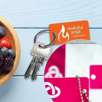
If you really want to stand out, consider non-traditional materials. Plastic business cards are becoming increasingly popular. They are durable, waterproof, and give a modern touch.
Clients are more likely to keep unique cards like these. Plus, they won't get easily damaged.
Environmental Considerations
In the health and wellness industry, being environmentally conscious can make a positive impact. Choose recycled paper or eco-friendly materials. This reflects your commitment to the well-being of the planet.
Clients who share these values will appreciate your extra effort.
Emphasizing Branding with Logos and Taglines
Your logo and tagline are crucial brand elements. Make sure to include them prominently on your business card. They help clients remember you and your services.
Logo Placement
Your logo should be one of the first things people see. Place it at the top or center of your card. Ensure it doesn't overpower other essential information.
A clear and high-resolution logo creates professionalism and trust.
Creating an Impactful Tagline
A catchy tagline can sum up what you offer. Keep it short and memorable. It should reflect the core of your services and values. Place it just below your logo or at the bottom of your card.
An impactful tagline can make your card even more memorable.
- Keep it short and sweet
- Reflect your values
- Make it memorable
Consistency Across Platforms
Ensure your logo and tagline are consistent across all platforms. This helps build a cohesive brand identity and makes it easier for clients to recognize you.
Use the same logo and tagline on your website, social media, and other marketing materials.
Ensuring Readability and Clarity
Readability is key. If clients can't read your contact info, they can't get in touch. Use clear, easy-to-read fonts and high contrast to ensure your details are accessible to everyone.
Choosing the Right Fonts
Fonts should be professional but not too fancy. Stick to classic fonts like Arial, Helvetica, or Times New Roman. Avoid overly whimsical fonts that can be hard to read.
- Use professional fonts
- Ensure font size is readable
- Stick to one or two font styles
Maximizing Contrast
High contrast between text and background ensures readability. Light text on a dark background or dark text on a light background works best.
Test different color combinations to see which works best.
Space and Alignment
Proper spacing ensures that your card doesn't look cluttered. Alignment helps organize information in a readable manner. Use left alignment for text as it is the easiest to read and looks cleaner.
Keep margins consistent.
The Final Touch: Proofreading
Before sending your business card to print, proofread! Typos and errors can tarnish your professional image. Double-check all information.
Double-Checking Contact Information
Make sure every piece of contact information is 100% accurate. One wrong digit or letter can mean you lose potential clients.
- Check phone numbers
- Verify email addresses
- Ensure website URLs are correct
Reviewing Design Elements
Look over every design element one last time. Check color consistency, logo clarity, and overall layout. You want to ensure that everything looks as intended before hitting print'.
Seeking a Second Opinion
Sometimes a fresh pair of eyes can catch mistakes you missed. Ask a colleague or a friend to review your card. Their input can be invaluable.
Getting another perspective can help you fine-tune your card to perfection.
Get an Instant Quote
Visit PlasticCardID to get started!
Work with Professionals at Plastic Card ID
If all this seems overwhelming, don't worry. At Plastic Card ID, we specialize in designing and printing high-quality business cards. Our expert team can help you create the perfect card that aligns with your brand. Contact us today at 650-300-9340 for more information!
Expert Design Assistance
Our team of expert designers can help you choose the right color schemes, motifs, and materials. We'll work closely with you to ensure that your card reflects your professional image perfectly.
- Personalized design consultations
- Professional graphic design services
- High-quality printing options
Printing Options
Whether you prefer traditional cardstock or modern plastic cards, we offer a variety of printing options. We use high-quality materials to ensure your cards look and feel premium.
Explore our range of finishes, textures, and special features like embossed logos or foil stamps.
Nationwide Service
No matter where you are, Plastic Card ID serves clients nationwide. We are just a call away at 650-300-9340. Our exceptional customer service ensures a smooth experience from start to finish.
Ready to elevate your professional image? Contact us today!
Remember: Your business card is often the first impression you make. Make it count with Plastic Card ID! Call 650-300-9340 now.