Design Tips for Consultant Business Cards
Table of Contents []
- Designing Consultant Business Cards
- Welcome to Plastic Card ID: Practical Design Tips for Effective Consultant Business Cards
- Choosing the Right Color Scheme
- Incorporating Consulting Motifs
- Including Essential Contact Information
- Adding QR Codes for Digital Portfolios
- Using Professional Font Styles
- Optimizing Layout and Design
- Highlighting Unique Selling Points
- Printing Quality
- Eco-Friendly Design Choices
- Calling Now is Simple!
Designing Consultant Business Cards
Welcome to Plastic Card ID: Practical Design Tips for Effective Consultant Business Cards

Creating effective and attractive business cards is essential for consultants. At Plastic Card ID, we are here to guide you through practical design tips, from professional color schemes to incorporating QR codes. Our goal is to help you build business cards that enhance your professional image and support your networking efforts.
Choosing the Right Color Scheme
Choosing the perfect color scheme for your business card is crucial. Colors convey emotions and can significantly impact the perception of your professionalism.
Understanding Color Psychology
Colors evoke specific emotions and meanings. Blue often implies trust and professionalism, while green suggests growth and stability.
It's important to choose colors that align with your consulting brand. For instance, a financial consultant might prefer blue, whereas a health consultant might choose green.
Creating Visual Contrast
Contrast is key to making your business card readable. Ensure your text color contrasts well with the card's background color.
Using a light background with dark text, or vice versa, helps important information stand out clearly.
Using Consistent Branding
Your business card should match your overall brand identity. Keeping a consistent color palette across all your marketing materials strengthens your brand recognition.
Consistency in color helps clients associate specific colors with your consulting services, building trust and familiarity.
Incorporating Consulting Motifs

Adding motifs relevant to your consulting field can make your business card more attractive and memorable.
Relevant Images and Icons
Consider using images or icons that relate to your consulting services. For instance, a management consultant might include a briefcase icon, while a tech consultant could use a gear or computer icon.
Relevant symbols help convey the essence of your services at a glance.
Minimalistic Designs
Less is often more. Opt for a clean, minimalistic design that ensures your card isn't cluttered but still eye-catching.
A well-placed motif can add a sophisticated touch without overwhelming the design.
Unique Shapes
Consider non-traditional shapes for your business card. Square or rounded corners can make your card stand out.
Unique shapes can be memorable and leave a lasting impression on potential clients.
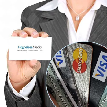
Including Essential Contact Information
Your business card must have all the necessary information clients need to reach you.
Basic Information
Ensure to include your full name, title, company name, and contact details such as phone number and email address. This is the primary purpose of your card. (Tip: Include your 650-300-9340 contact number).
Make sure this information is prominently displayed and easy to read.
Social Media and Website
Including your website and social media handles can drive traffic to your digital presence.
Clients appreciate multiple ways to connect, making it easier for them to engage with your services. (Tip: Use professional social media platforms related to your consulting services).
Addressing Usability
All information should be up to date and accurate. Clients will appreciate a card that provides seamless, reliable contact details.
An error-free business card reflects your attention to detail and professionalism.
Get an Instant Quote
Click the image above to get started!
Adding QR Codes for Digital Portfolios
QR codes can bridge the gap between your physical business cards and your online portfolio.
The Benefits of QR Codes
QR codes provide an easy way for clients to access more information about your services. A quick scan can lead them directly to your portfolio or website.
This technology adds a modern touch to your business card, making it highly functional and up-to-date.
How to Generate and Place QR Codes
Generating a QR code is simple. Use online tools to create a code that links to your portfolio. Once done, integrate it into the design of your business card.
Place the QR code in a non-intrusive yet visible location on your card. Typically, the back of the card works well as it keeps the front clean and professional.
Ensuring QR Code Functionality
Test the QR code to ensure it works correctly and leads to the intended destination. This can prevent any potential frustration for clients.
Regularly update the linked content to keep it relevant and current.
Using Professional Font Styles

The font style you choose will affect the overall readability and professionalism of your business card.
Choosing the Right Font
Opt for fonts that are easy to read. Sans-serif fonts like Arial or Helvetica are widely recommended for their clarity.
Avoid overly decorative fonts, as they can make your card look cluttered and harder to read.
Font Size and Hierarchy
Maintain a logical hierarchy by using varying font sizes. Your name and company name should be the most prominent, followed by your title and contact details.
Consistent font sizes and styles can make your business card look more organized and professional.
Color and Legibility
Ensure the font color contrasts well with the background. This is essential for readability.
Using bold or italic styles sparingly for emphasis can also draw attention to important details.
Optimizing Layout and Design

The layout of your business card should be well-organized and aesthetically pleasing.
Symmetry and Balance
Design a layout that balances text and images evenly. Asymmetry can be jarring and make the card harder to read.
Use alignment and spacing to create a harmonious design that guides the reader's eye naturally.
Using White Space
White space, or negative space, helps keep your card uncluttered. It makes the card easier to read and more visually appealing.
Strategically placed white space can highlight important areas, making the overall design more effective.
Proportion and Scale
Use appropriate proportions for different elements. Your logo should be noticeable but not overpowering the contact details.
Scaling each element correctly ensures that all information is readable and the design remains cohesive.
Highlighting Unique Selling Points
Make sure your business card communicates what makes you unique.
Special Certifications and Skills
Including certifications or unique skills can make your card stand out. It provides an additional layer of credibility.
Potential clients will be more inclined to contact you if they see you have the specialized skills they need.
Client Testimonials
Including a brief testimonial or a notable client name can boost your card's impact. It serves as a quick endorsement of your capabilities.
Keep it concisejust a line or two is enough to make a powerful statement.
Awards and Achievements
If you've won any awards, showcase them on your card. It helps establish authority and trust.
Highlighting achievements can differentiate you from competitors, making your card more memorable.
Printing Quality
The quality of your business card reflects the quality of your services.
Choosing the Right Paper
Select high-quality paper stock. A heavier weight adds a premium feel.
Textured paper can add an exclusive touch but ensure it doesn't impact readability.
Printing Techniques
Consider advanced printing techniques like embossing or foil stamping. These can add a unique, tactile element to your card.
Consult with your printer to explore options that fit your budget and brand image.
Ensuring Durability
Using protective coatings like gloss or matte finish can enhance durability. It prevents wear and tear, keeping your card looking new longer.
Clients will appreciate a well-made, durable card. It shows you care about details and quality.
Eco-Friendly Design Choices
More clients appreciate sustainability. You can reflect your eco-consciousness in your business card design.
Recycled Materials
Using recycled paper can be a great way to show your commitment to the environment. It's often indistinguishable from regular paper but offers a green benefit.
Ensure the recycled content adheres to the same quality standards to maintain professionalism.
Eco-Friendly Printing
Employ eco-friendly printing practices, such as soy-based inks. They are less harmful to the environment, providing an additional selling point.
Sustainable practices can be a unique selling point for clients who value corporate responsibility.
Minimizing Waste
Design your cards efficiently to minimize material waste. Avoid excessive embellishments that don't add functional value.
Opting for simpler designs not only reduces waste but often enhances readability and functionality.
Get an Instant Quote
Visit PlasticCardID to get started!
Calling Now is Simple!
Convinced about upgrading your business cards? CALL PLASTIC CARD ID now at 650-300-9340 for ordering yours!
Previous Page